
Campaign Page Structure
About Sections
Sections act like building blocks, allowing you to organize your page content in a structured way. This makes creating beautiful campaign pages in Campaign Star much easier and more intuitive.
Think of a Section as a specific paragraph or segment of your page. Different Sections can have different themes, such as a Topic Banner Section, a Related Products Section, or a Call-to-action (CTA) Section.
If AMP tags are configured at the Section level, Campaign Star will automatically fetch the corresponding products or categories based on the selected tags when you create Product List or Category List components within that Section, saving you the time of manually setting up content.
👉 For more details, please see Section Base Tags.
About Page Content
Component Library Options
By clicking the [+] icon in the editor's left toolbar, you can view the [Elements] and [Sections] tabs in the component panel.
- Sections: System-provided section templates or custom templates designed by you.
- Elements: Displays various components by type, providing a flexible design space.
The following introduces the content options under the [Elements] category.
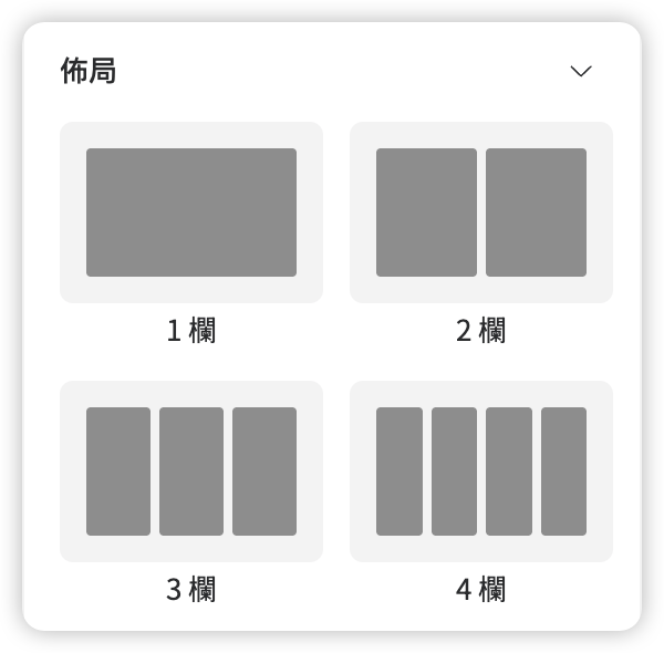
Layout
Determines how many columns your component will have.
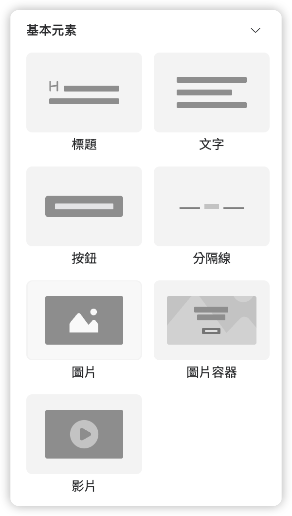
Basic Elements
- Heading
- Text
- Button
- Divider
- Image
- Image box - You can drag and add other components into this image box to create diverse image-and-text layouts.
- Video
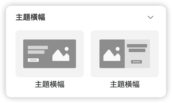
Topic Banner
- Topic Banner - A Section-based component with a pre-set image and text layout.
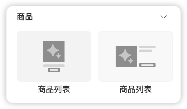
Product
- Product list - Allows consumers to browse specific products related to the campaign, thereby increasing product exposure and boosting sales growth.
Category
- Category list - Increases campaign page traffic and promotes exposure of specific categories by allowing consumers to browse related categories.
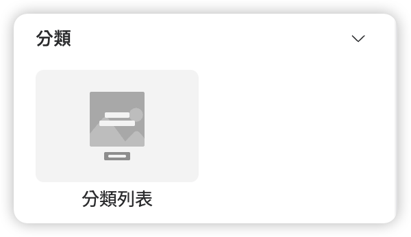
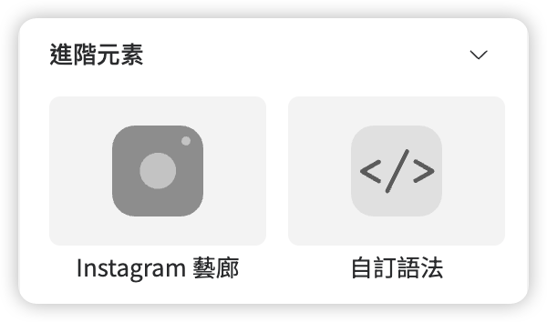
Advanced Elements
Component Hierarchy and Structure
Section
Row
Column
- Heading, Text
- Image, Image box
- Video
- Button
- Divider
- Custom code
Category list
Category column
- Category image box
- Category text
- Category button
Product list
Product column
- Product content row
- Product content column 1
- Product image
- Product content column 2
- Product title
- Brand
- Product price
- Price
- Sale price
- Discount
- Product button
Product list view more button
Instagram gallery
Instagram post
Load more button
How to Add Content
Select the content you want to add from the left panel and join it to the canvas via drag-and-drop:
- First, decide on the layout you want to insert into the page (example below shows a two-column layout).
- Once the layout is confirmed, drag and drop components into that layout.
- You can summon the Layer Tree on the left at any time to confirm the component layout.
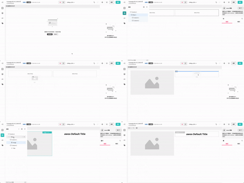
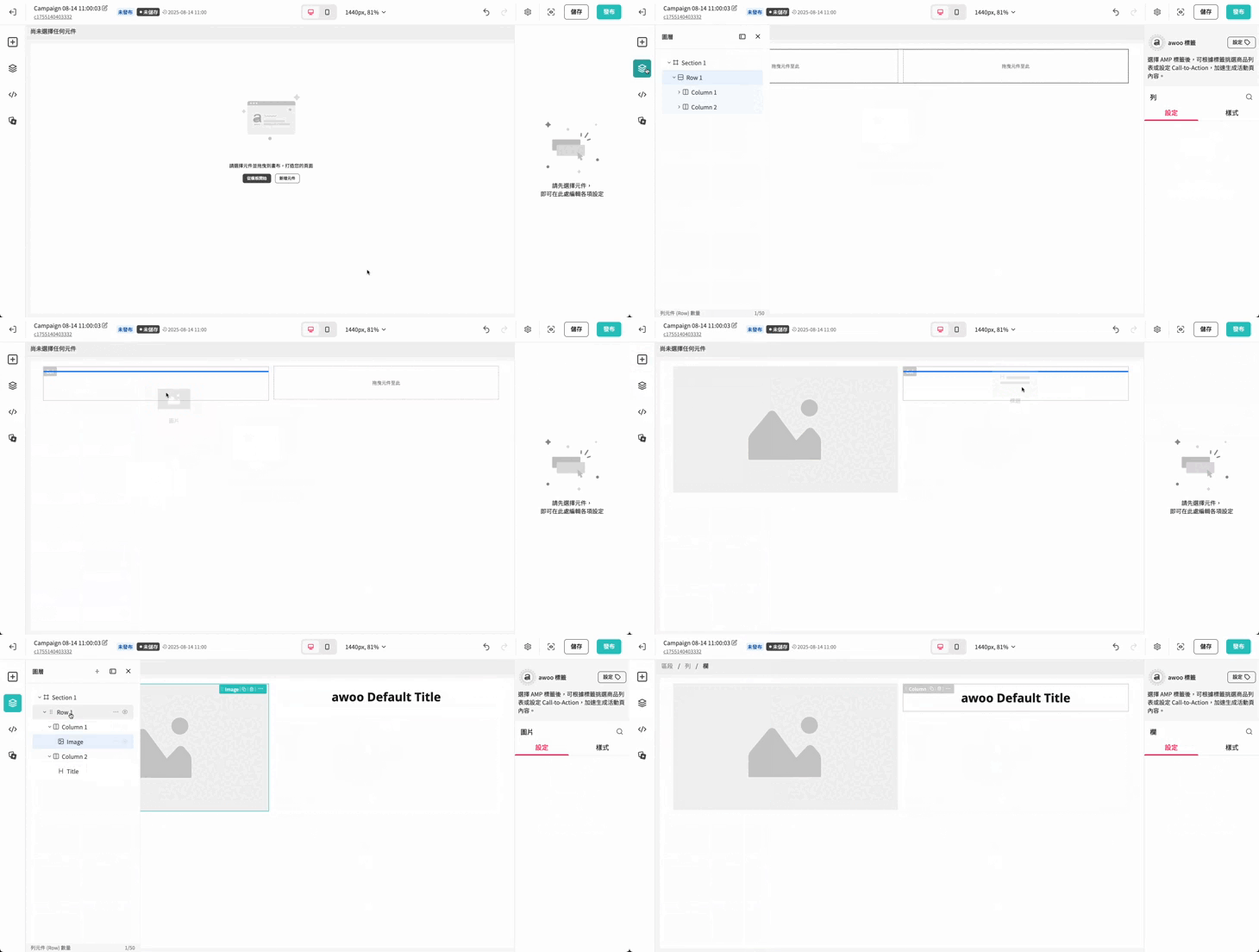
If you are adding the first component to a blank canvas, please drag the component to the very top of the canvas and wait for the blue positioning line to appear before releasing the mouse.
Updated 8 months ago