
Maximum Width Settings for Pages, Sections, and Rows
Setting "max-width" prevents page content from stretching infinitely as the window width increases, avoiding layout issues.
👩🏫 What is CSS max-width?
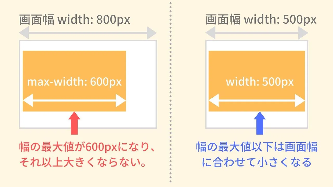
- When the parent structure's width ≥ max-width value, the content will be based on the "max-width value" and rendered at 100%, without overflowing.
- When the parent structure's width < max-width value, the content will be based on the "parent structure's width" and rendered with proportional scaling.
⚙️ Configuration
- When not in full-width display, the maximum width can be set in either px or % modes.
- Default is px mode.
- In px mode, the setting range for maximum width is 700 ~ 4,000 px.
- Entering a value that exceeds the parent structure's width is supported, but the actual rendered maximum width on the frontend will still equal the parent structure's width; therefore, the content will not exceed the parent structure.
🎨 Supported Items
-
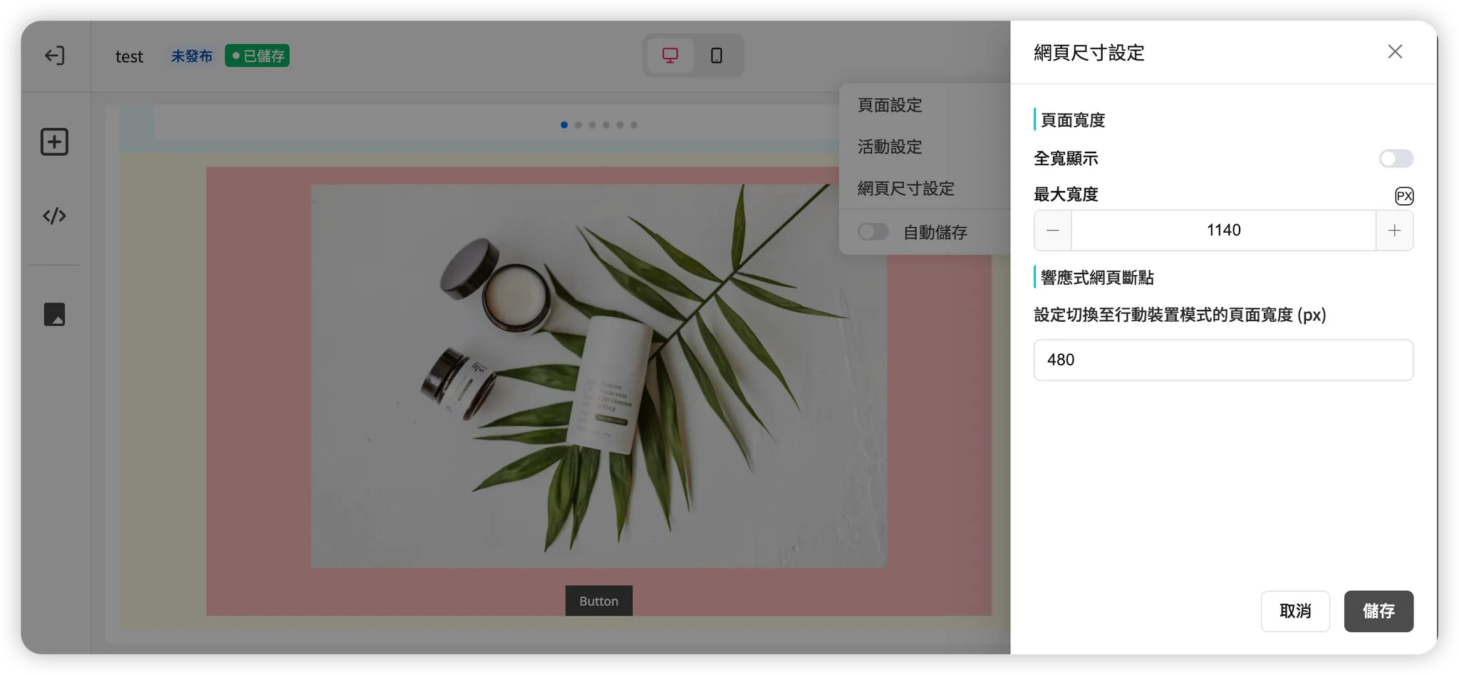
Entire Page
- Access: Top navigation bar > Settings (gear icon) > Page size settings
- Default: "Non-full width" with a maximum width of 1,140 px.
-
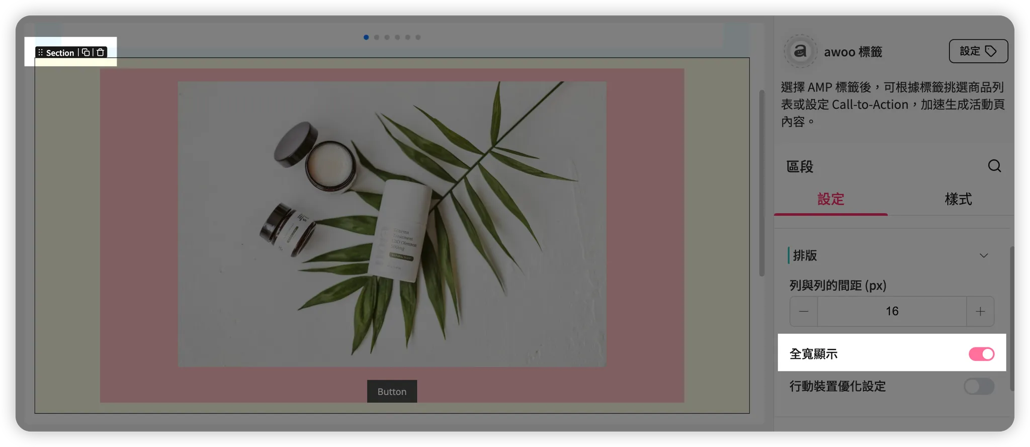
Single Section Component
- Access: Right component settings panel > Settings tab > Layout
- Default: "Full-width display," which follows the width of the entire page.
-
Single Row Component
- Access: Right component settings panel > Settings tab > Layout
- Default: "Full-width display," which follows the width of the parent Section.
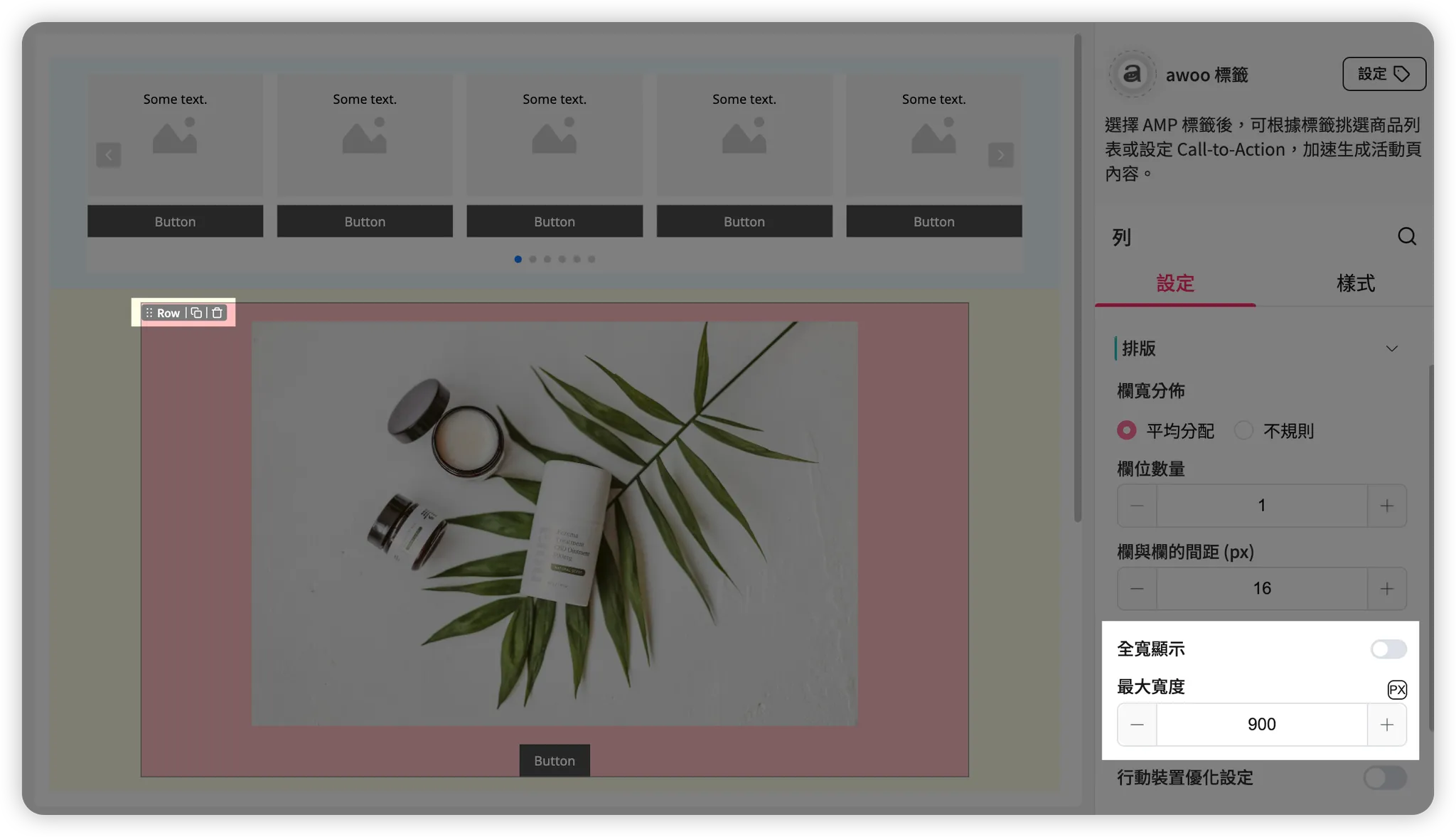
Composite components such as Product list, Category list, and Instagram gallery are essentially specialized Row components and follow the same width setting logic.
Updated 8 months ago
Did this page help you?